Module 3
Design
We use Canva for a lot of our posts. You would have had an email and information when you became and instructor on how to use Canva, ideas on what to posts etc.
We cannot stress enough the importance of staying on brand.
What do we mean by staying “on brand”?
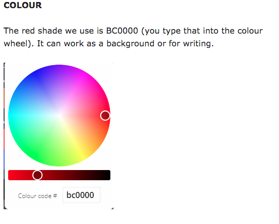
Well, if every single instructor used their own colours and colours etc to post on social media/for flyers – Turn’d Up Fitness would have no online identity, except via the official socials. Since we all belong to the same brand, it’s so important to communicate this via your posts.
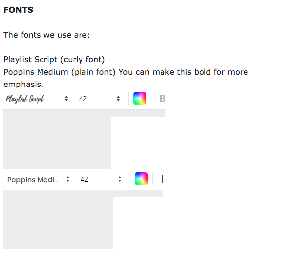
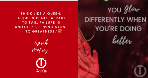
Steve our designer told us that it is better to use Poppins for longer bits of text (ie quotes) as Playlist can be quite hard to read in bulk. Playlist is better used for individual words you want to emphasise or for names, etc. You do have to open a new text box to use a different font, annoyingly, but it looks good in the end!
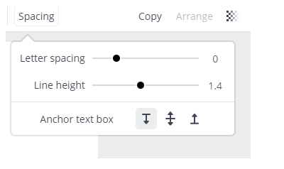
You can play around with the spacing and font size as well so it’s easy to read.
LOGO
We can’t give you the transparent logo to put on to things as it’s not secure business practice. We need to approve everything our logo is put on and this would get to be too much for us to monitor. Please don’t copy and paste the Turn’d Up logo onto things or this reason. You have your names with the new Turn’d Up logo and it’s fine to use them though.
PART 2 – COMING IN 2020
Part 2 of your design module will feature one of our own – Meg Baldwin! For those of you who know her, you will know how amazing she is at design for social media – so it would be crazy of us not to get her to write part 2!
Coming in 2020 – stay tuned!
Follow Meg on Instagram: @meg_turndupfitness